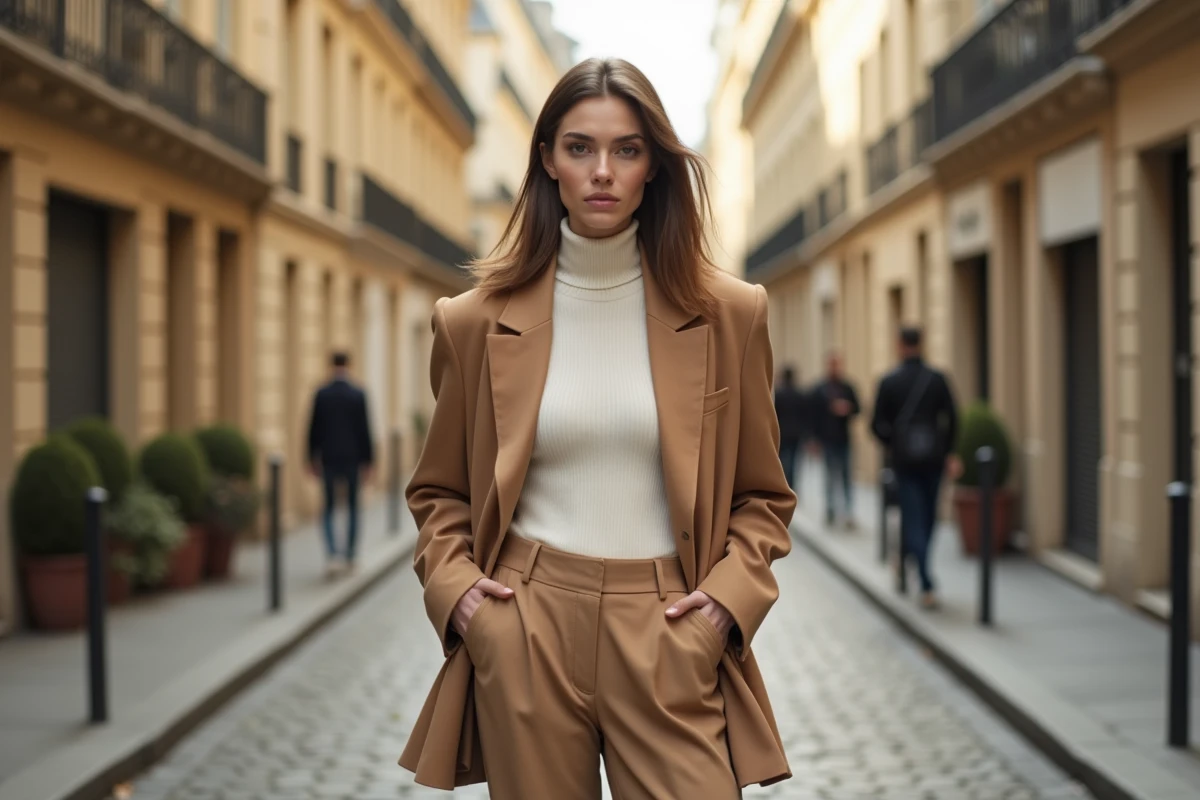
The spring-summer 2026 fashion trends are structured around four directions: lightweight layering, polka dot prints, satin materials, and a pastel palette dominated by butter yellow. Adopting these codes does not mean replacing your entire wardrobe. Most of these orientations can be added to pieces already present in a wardrobe built over the seasons.
Upcycling Layering: Adapting Spring-Summer 2026 Trends Without Impulsive Buying
Layering remains the most accessible lever to refresh a look without consuming new items. The principle: combine two or three layers of clothing that you already own, playing with lengths and transparencies.
A graphic t-shirt worn under a satin slip dress, for example, transforms two basics into a silhouette aligned with the season’s codes. The slip dress, a recurring piece for several seasons, gains character as soon as it is styled as an outer layer rather than as a standalone dress.
The idea of clothing upcycling through layering goes beyond simple assembly. It involves assigning a new function to an existing garment: a lace scarf becomes an asymmetrical top tied over a plain tank top, an oversized shirt is worn open over a monochrome outfit to create volume without buying a jacket. Draped or asymmetrical pieces, identified among the season’s trends, lend themselves particularly well to this type of repurposing.
To deepen these associations and spot complementary pieces, fashionup.fr offers a catalog that allows you to target specific items rather than giving in to unplanned purchases.
Polka Dot Prints and Graphic Patterns: Decoding the Season’s Fashion Trends
Polka dot prints are among the most visible patterns in the spring-summer 2026 collections. Their return is not limited to dresses: shorts, blouses, and wrap skirts showcase the pattern in various cuts.
A technical point deserves attention. The polka dot works by size contrast: a small diameter pattern on a light background produces a classic effect, while a large dot on a dark background leans towards a more assertive graphic register. The choice of the ratio between the size of the pattern and the surface of the garment determines the visual balance of the outfit.
The graphic t-shirt, another trend identified this season, follows a similar logic. A centered and contrasting visual captures the eye and structures the silhouette, especially when the rest of the outfit remains neutral. Pairing a t-shirt with a strong message with beige pants or barrel jeans (a loose fit that flares slightly below the knee) is enough to anchor the look in current codes without multiplying strong pieces.
Combining Patterns and Layering Without Overloading
A common pitfall is stacking prints. A simple rule limits the risk: one strong pattern per outfit, the other pieces remain solid. The layering described above absorbs a polka dot print well if the adjacent layers are in neutral tones or solid materials.
- A polka dot blouse worn under a solid short jacket creates a focal point without saturating the silhouette.
- A polka dot short balances with a raw linen or thick cotton top, without any other pattern.
- A lace scarf with a micro-pattern placed over a graphic t-shirt works as long as both pieces share at least one common color.
Satin Materials and Draping: Building a Stylish Look with Durable Pieces
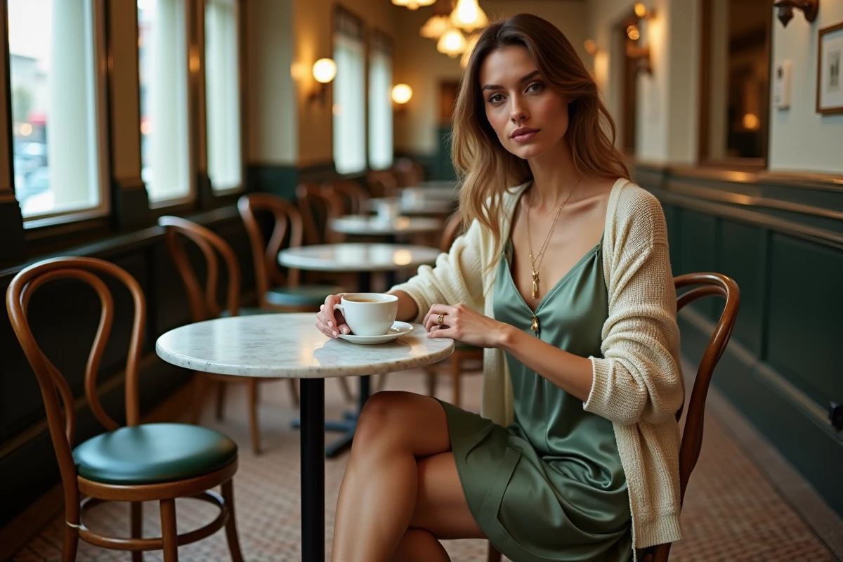
Satin and fluid materials occupy a central place this season, particularly through the slip dress, wrap skirts, and draped clothing. These textiles pose a maintenance challenge that cheap synthetic fibers amplify: quick wrinkling, visible snags, dull appearance after a few washes.
Choosing a satin with a sufficiently dense weight extends the lifespan of the garment and maintains the fluidity of the drape. In thrift stores, these pieces can be identified by touch: a heavy satin glides between the fingers without sticking, whereas a fine polyester clings to the skin.
The asymmetrical drape, another hallmark of the season, relies on the weight of the fabric. A material that is too light will not hold the desired fold. This is why vintage draped garments, often made from heavier fabrics than their current fast fashion equivalents, offer a superior look at a comparable budget.
Butter Yellow Palette and Pastel Tones: Integrating Trendy Color into an Existing Wardrobe
Butter yellow stands out as the key shade of spring-summer 2026. This warm yet desaturated tone distinguishes itself from bright yellow by its ability to blend into a neutral wardrobe without creating a visual break.
A common mistake is to buy a statement piece (coat, long dress) in a color strongly associated with a specific season. The risk of fatigue increases with the amount of fabric involved. It is better to introduce butter yellow through accessories or pieces with low visual bulk:
- An oversized butter yellow sweater worn over the shoulders, in a light layering, adds color without monopolizing the silhouette.
- A scarf or belt in this tone warms up a white linen or light denim outfit.
- A solid butter yellow t-shirt tucked under a denim jacket or navy blazer anchors the trend in a daily register.
Adjacent pastel tones (lavender, mint, powder pink) work well as complements, but their accumulation in the same outfit dilutes the contrast. One strong pastel paired with neutrals produces a sharper effect than a complete monochrome.
The spring-summer 2026 season offers enough entry points to renew a style without completely revamping a wardrobe. The most versatile pieces – graphic t-shirt, slip dress, oversized sweater, lace scarf – can be found both second-hand and in stores. The common thread remains thoughtful layering: each added layer should have a precise visual function, not just fill a void.